Typography design is more than choosing a “nice font.” It’s the silent voice of your brand. The moment someone lands on your website, reads a social post, or opens your brochure, your fonts tell a story—professional or amateur, confident or confused. I’ve seen strong brands lose credibility simply because their typography didn’t match their message. Choosing the right fonts is a strategic branding decision, not a decorative one.
Understand Your Brand Personality First
Before opening Google Fonts or Adobe Fonts, step back and define your brand’s personality. Are you modern or traditional? Playful or corporate? A fintech startup and a luxury fashion brand should never “sound” the same visually.
Typography design works best when it reflects:
- Your target audience
- Your industry standards
- Your brand tone (bold, friendly, premium, minimal)
This clarity prevents random font choices and keeps your branding consistent across platforms.
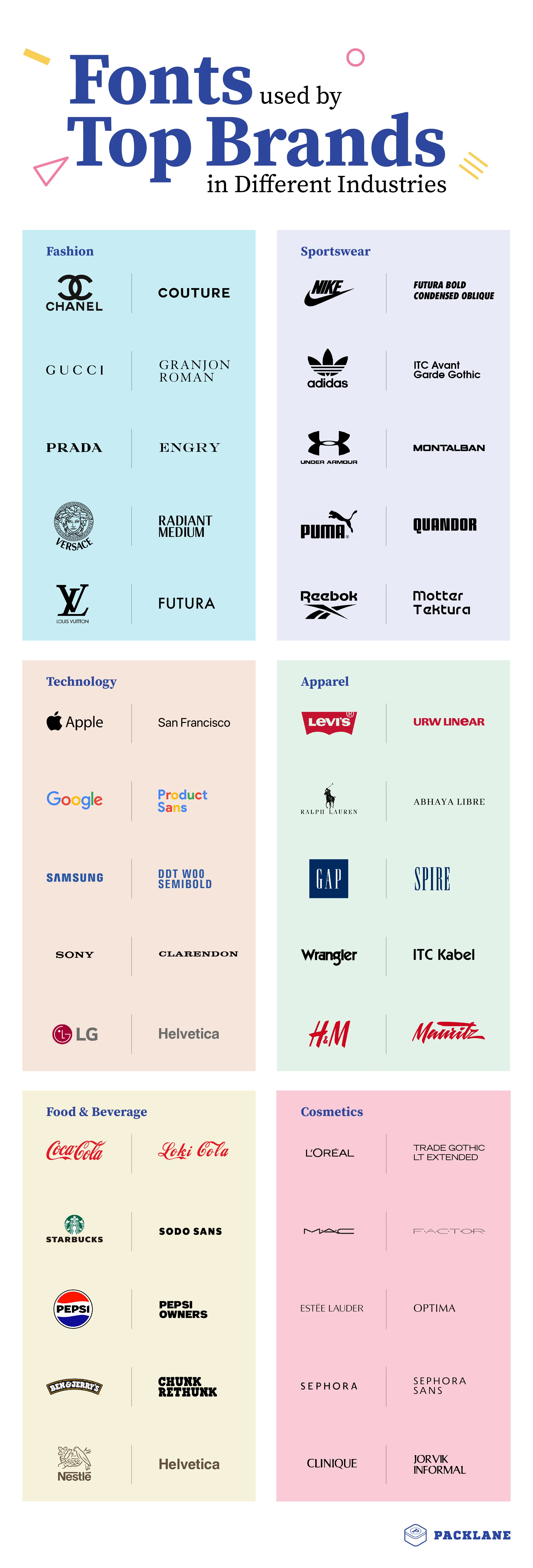
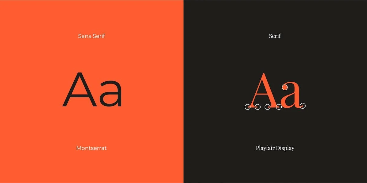
Serif vs Sans-Serif: Choose Typography Design with Purpose
Serif fonts often communicate trust, heritage, and authority—commonly used by law firms or editorial brands. Sans-serif fonts feel modern, clean, and digital-friendly, making them ideal for tech companies and startups.
The key is not trends, but relevance. A trendy font that doesn’t fit your brand will age badly and confuse your audience.
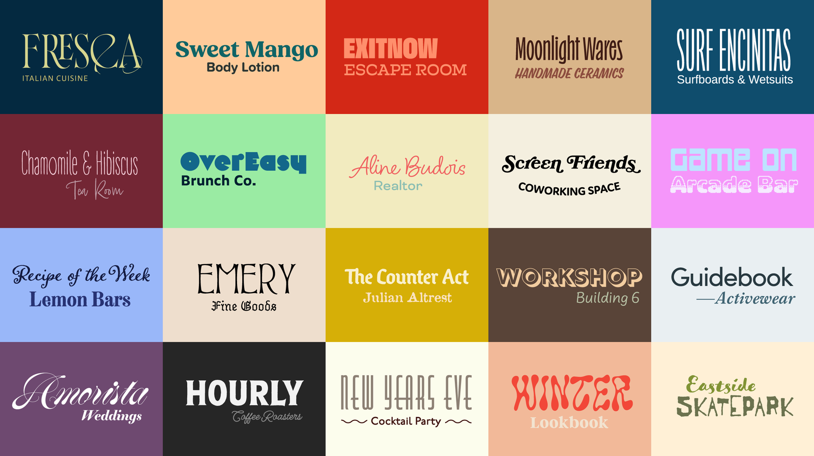
Limit Your Font Pairings
One of the biggest typography design mistakes is using too many fonts. Ideally, stick to:
- One primary font (headings)
- One secondary font (body text)
- Optional accent font (used sparingly)
This balance improves readability and keeps your brand visually disciplined.
Prioritize Readability Across Devices
Your typography must perform well on mobile, tablet, and desktop. Thin or overly decorative fonts may look attractive but fail in real-world usage. Always test font sizes, spacing, and contrast.
Good typography design improves:
- User experience
- Time spent on site
- Conversion rates
These factors directly impact SEO and brand trust.
Stay Consistent Everywhere
Once you choose your fonts, document them in a brand style guide. Use the same typography across your website, social media, presentations, and print materials. Consistency builds recognition—and recognition builds trust.
Learn from Professionals
If typography feels overwhelming, it’s smart to work with an experienced Graphic Designer who understands branding psychology, not just font files. At Vaxenta Design Studios, typography design is treated as a strategic asset, not an afterthought.
Explore more branding insights at 👉 https://vaxenta.com
For font resources, you can also explore Google Fonts as a reliable external reference: https://fonts.google.com
Final Thoughts about Typography Design
Typography design is one of the most powerful yet underestimated branding tools. When chosen thoughtfully, fonts create clarity, credibility, and emotional connection. When ignored, they silently weaken even the strongest brand message. Choose wisely—your brand’s voice depends on it.